Commercial
What Your Lighting Says About Your Brand (Whether You Like it or Not)
Every brand invests in its visual identity. The logo, the colour palette, the typography, the way a website feels. Hours of decision-making go into communicating the right message before a customer ever walks through the door.
And then they walk through the door and the lighting tells them something completely different.
This happens more often than most people realise. Not because the lighting was chosen carelessly, but because it was chosen without considering what it communicates. Lighting is one of the most powerful brand signals in any physical space, and unlike a logo, it works on people before they have had time to think about it. The response is instinctive, immediate and surprisingly difficult to override with anything else in the room.
Understanding what your lighting is saying is the first step to making sure it is saying the right thing and at No Grey Area, we can help you get this right every time.
Light Communicates Before Anything Else Does
Walk into two coffee shops on the same street. One has warm, low light pools of amber falling across wooden tables, shadows in the corners, a sense of enclosure and calm. The other is bright, even and cool every surface clearly lit, the space feeling open, efficient and easy to move through quickly.
Both are communicating clearly. One says: stay a while. The other says: we will have you in and out in ten minutes.
Neither is wrong. But if the brand promise of the first is warmth, craft and community, and the second is speed and convenience, then the lighting is doing exactly the right job in both cases. The problem comes when there is a mismatch when the brand says one thing and the space says another.
In commercial interior design, that mismatch is more common than it should be, and it is almost always the result of lighting being treated as a functional decision rather than a brand one.
Colour Temperature: The Most Immediate Signal
Of all the variables in a lighting design scheme, colour temperature has the most immediate and instinctive effect on how a brand is perceived.
Measured in Kelvin, colour temperature runs from warm amber tones at the lower end of the scale to cool, blue-tinged white at the higher end. The psychological associations attached to each are well established and apply consistently across cultures.
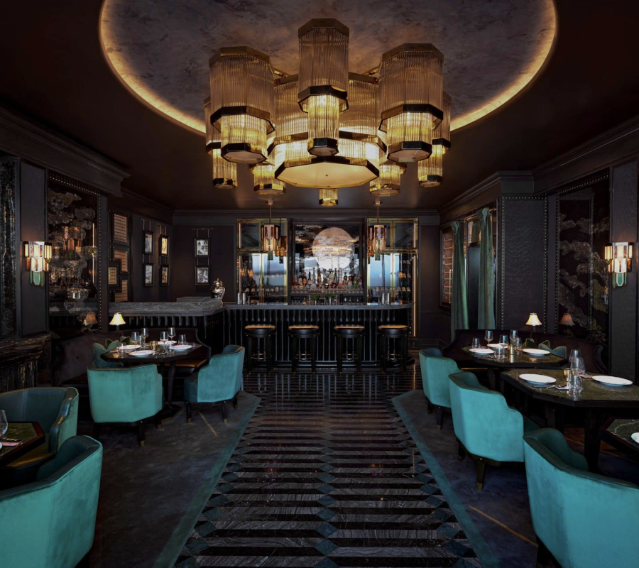
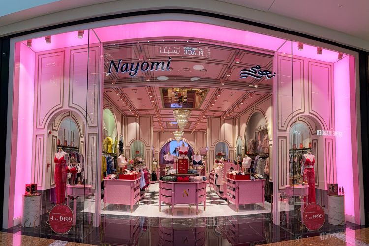
Warm light (2,700K-3,000K) communicates intimacy, comfort, quality and approachability. It slows people down. It makes them feel at ease. In hospitality lighting design, this is the default register for a reason restaurants, hotels and spas that want guests to linger, spend and return understand that warm light is part of what makes that happen.
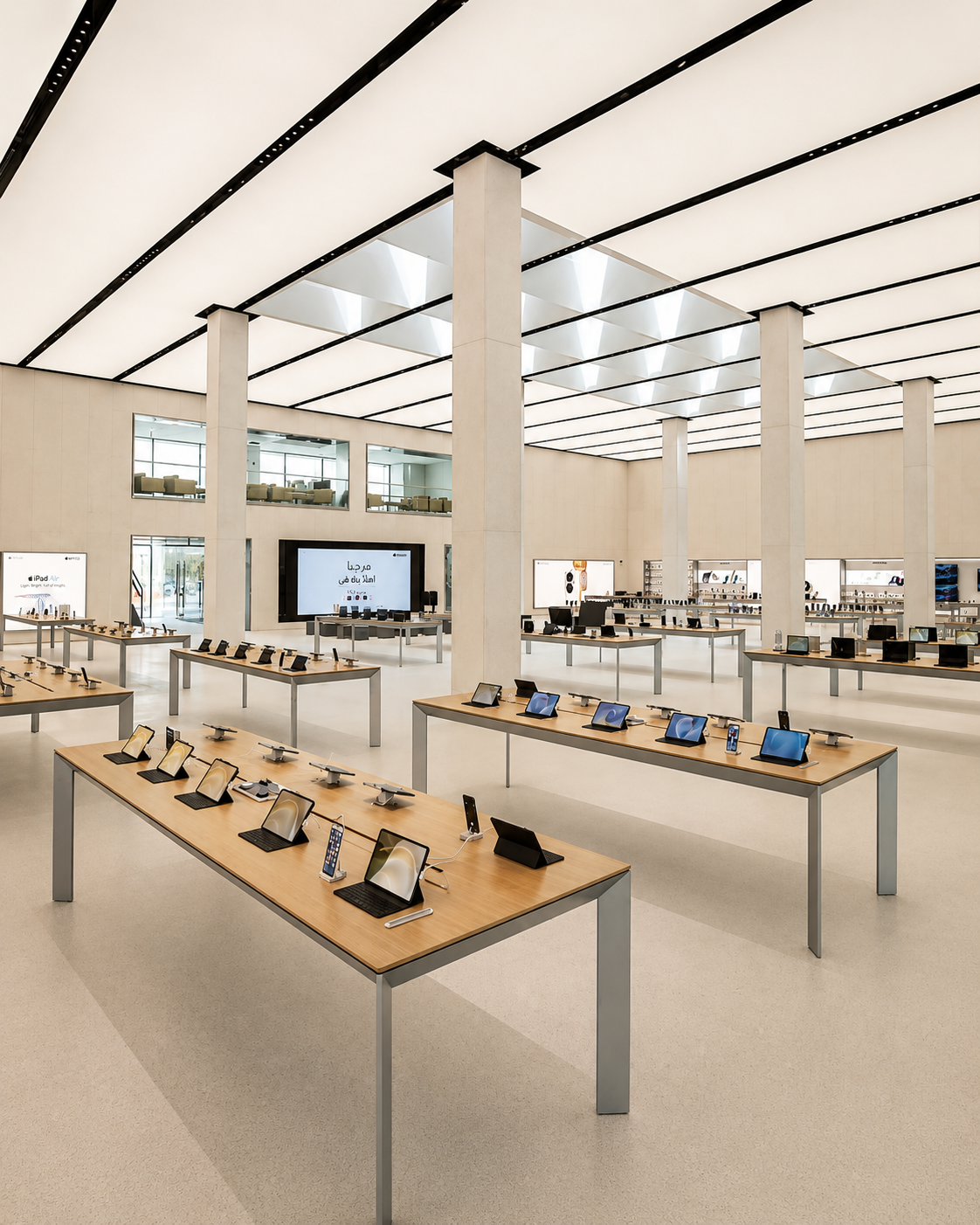
Neutral light (3,500K-4,000K) communicates clarity, professionalism and efficiency. It keeps people alert and focused. It is the appropriate register for workplace environments, healthcare settings and retail spaces where accurate colour rendering of products matters more than atmosphere.
Cool light (5,000K and above) communicates precision, cleanliness and energy. It is the light of operating theatres, logistics facilities and technology environments. Used in contexts where it does not belong a luxury boutique, a fine dining restaurant it reads as cheap, clinical and uncomfortable, regardless of the quality of everything else in the space.
The question to ask is not which colour temperature you prefer. It is which one your brand belongs in.
Brightness: How Light Levels Set Expectations
Light levels communicate price, pace and exclusivity in ways that are rarely consciously processed but are consistently felt.
Bright, evenly distributed light reads as democratic and accessible. It says: everyone is welcome, everything is visible, there is nothing to hide. This is appropriate for supermarkets, fast food environments, pharmacies and any space where efficiency and transparency are the brand values in play. Linear lighting systems and high-output ceiling solutions suit these environments because they deliver consistent, high lux levels across large floor areas without variation.
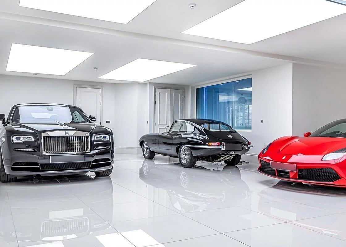
Lower, more directional light reads as selective and considered. It draws attention to specific things a product on a shelf, a dish on a table, a piece of art on a wall while letting the surrounding space fall into relative shadow. This selective illumination communicates curation. It says: we have chosen what matters. In luxury retail, fine dining and premium residential environments, this kind of intentional contrast between highlight and shadow is one of the primary tools through which exclusivity is communicated.
The error many brands make is assuming that brighter is better. In quality-led environments, the opposite is often true. Flooding a luxury space with high lux levels undermines the sense of curation the brand depends on. It makes everything feel equally important which means nothing feels special.
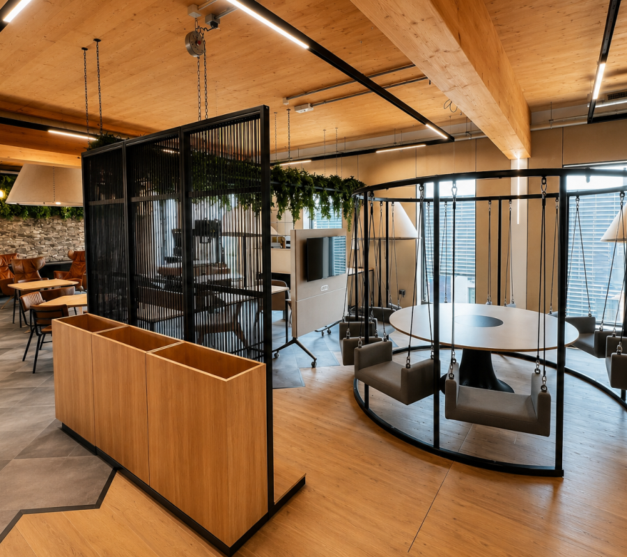
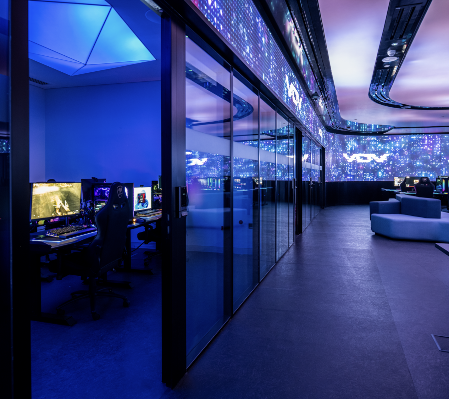
Fixture Choice: Hidden, Functional or Statement
Beyond colour temperature and brightness, the physical form of a lighting installation carries its own set of messages and the decision about whether light sources should be concealed, understated or celebrated is one of the most revealing brand decisions a space can make.
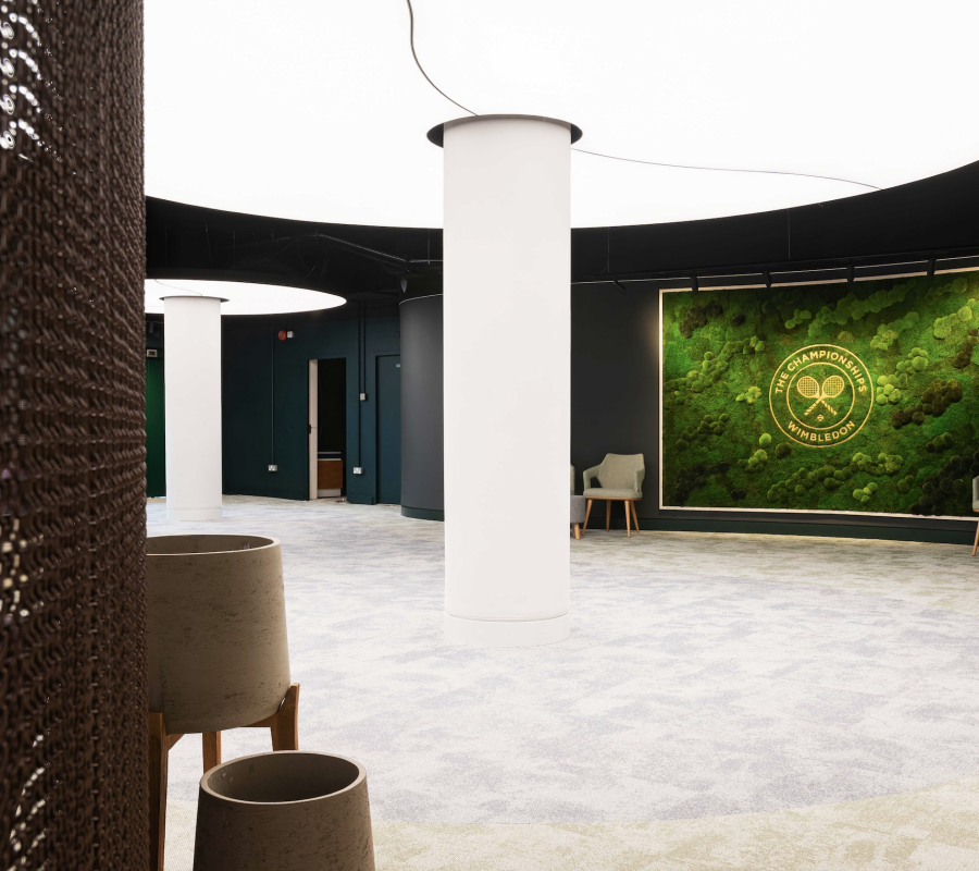
Concealed light sources – LED strip lighting recessed into architectural details, light diffused through stretch ceiling membranes and neon flex LED tracing a reveal without a visible source all communicate sophistication and restraint. The light exists without explanation. The effect is seamless. Brands that value craftsmanship, precision and quiet confidence tend to favour this approach because it reflects those values in the built environment.
Functional fittings – standard downlights, surface-mounted panels, track systems communicate practicality and transparency. They are the appropriate choice where the brand message is straightforwardly utilitarian, or where the budget genuinely does not allow for anything more considered. The risk is in using functional fittings in spaces where the brand aspires to something more, because the fitting will always tell a different story than the brand promise.
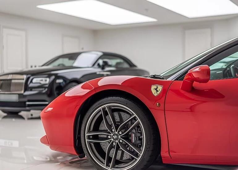
Statement fixtures – a sculptural ring pendant installation above a reception desk, a decorative light fixture that becomes the visual centrepiece of a dining room, a custom light box ceiling that reframes an entire space to communicate ambition, originality and investment. They tell visitors that the brand takes its environment seriously. They become the detail that guests photograph, describe and remember. In competitive sectors where differentiation is everything, a well-chosen statement fixture is not an indulgence. It is a brand decision with a measurable return.
Sector Examples: What the Right Lighting Decision Looks Like in Practice
Retail
In retail, lighting is one of the primary tools through which merchandise is presented and perceived. High CRI sources CRI 90 and above, and CRI 95 or higher in premium environments ensure that colours, textures and finishes read accurately under artificial light. A garment that looks one colour on the shop floor and another in daylight is a return problem, not just an aesthetic one.
Beyond product rendering, retail lighting controls dwell time and directs movement. Brighter zones draw customers in. Accent lighting slows them down at key product positions. The relationship between ambient light and accent light, typically a 3:1 or 5:1 ratio in quality retail environments, is one of the most studied and least publicly discussed tools in commercial lighting design.
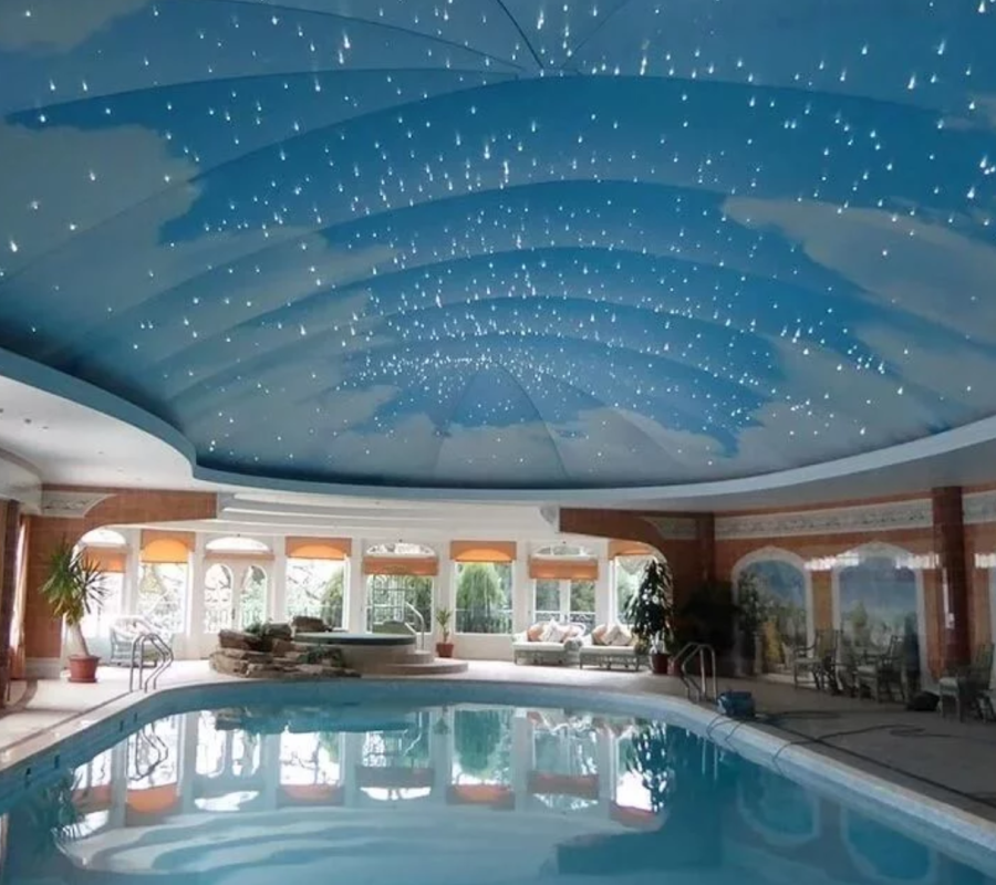
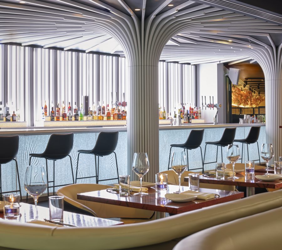
Hospitality
In hospitality, lighting is the atmosphere and atmosphere is the product. Guests in a hotel, restaurant or spa are not buying a room or a meal in isolation. They are buying an experience, and light is one of the primary variables that determines whether that experience delivers on its promise.
The most effective hospitality lighting schemes use tunable white lighting or well-designed fixed schemes to shift the register of a space across the day warmer and dimmer as the evening progresses, creating a sense of transition that mirrors the natural rhythm of light and supports the mood the brand is trying to create. A hotel lobby that feels exactly the same at 7am and 10pm has missed an opportunity that its guests will feel even if they cannot articulate it.
In spaces with acoustic challenges, open-plan restaurants, venues with hard surfaces and exposed ceilings, acoustic lighting solves two problems within a single, well-designed element, managing sound absorption and delivering precise, quality light simultaneously.
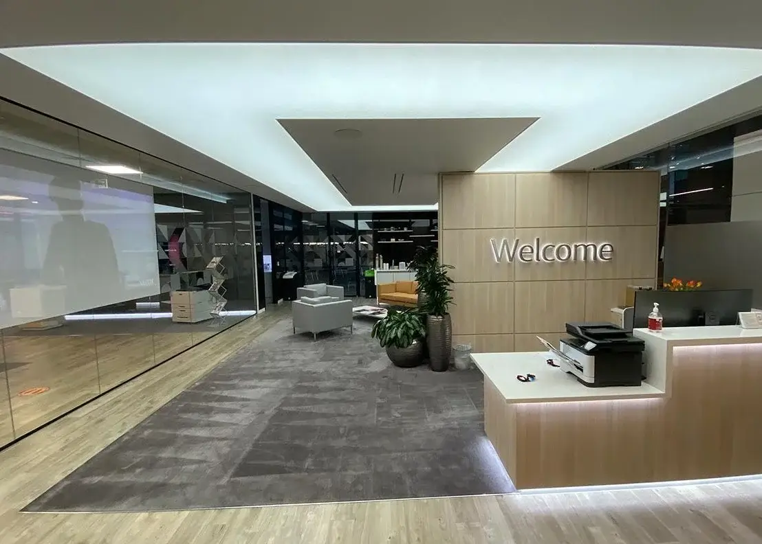
Corporate
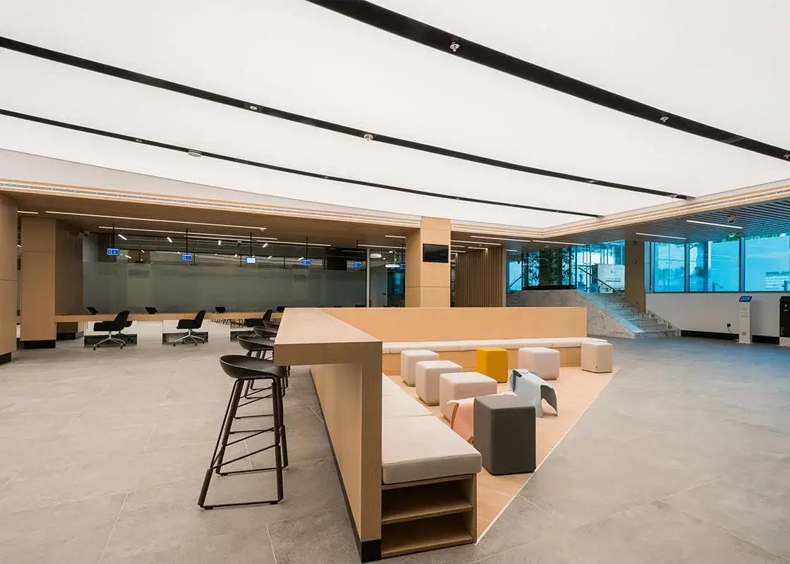
In corporate environments, lighting communicates culture as much as it communicates function. A workplace that has invested in considered architectural lighting design with appropriate lux levels for focused work, glare-controlled fittings with UGR below 19, and zones that allow for different working modes sends a clear message to the people who work in it: this organisation takes the experience of being here seriously.
The inverse is equally communicative. A corporate office fitted with standard ceiling panels and no consideration for light quality tells employees and visitors something about how the organisation values its environment and by extension, the people in it. In a competitive talent market, that signal matters more than most organisations account for.
Control solutions in workplace environments add a further layer of brand communication. A space that adapts that feels different during a client presentation than it does during focused individual work demonstrates intelligence and intentionality in the design of the working environment.
The Test Worth Running
There is a straightforward way to assess what your current lighting is communicating. Walk into your space or ask someone who has never been there to walk in and before they have looked at anything else, ask them how it feels.
Not what they think of the furniture or the finishes. How it feels.
The answer will tell you more about what your lighting is saying than any specification document. And if the answer does not match what the brand intends to communicate, that is the starting point for a conversation worth having.
Lighting cannot fix a weak brand. But it can undermine a strong one. And when it is working correctly when the colour temperature, the light levels and the fixture choices are all aligned with what the brand is trying to say it amplifies everything else in the space in ways that no other single element can match.
Working With No Grey Area
At No Grey Area, we work with architects, interior designers and clients across retail, hospitality and commercial projects to develop lighting schemes that are built around what a space needs to communicate not just what it needs to illuminate.
If you are reviewing a fit-out, planning a refurbishment or briefing a new project, get in touch with our team to discuss how lighting design can be used as a deliberate brand tool from the outset.