Colour Temperature Is a Decision, Not a Default
Understanding the Kelvin scale is where every lighting design conversation should begin. Lower Kelvin values produce warm white light. Higher values produce cool white light. And somewhere between the two, 4,000K became the commercial default without most briefs ever choosing it deliberately.
Across the UAE, EN 12464-1 is the widely referenced benchmark for indoor workplace commercial lighting specification, applied alongside Dubai Municipality requirements and certifications such as Estidama Pearl and Al Safat. In the UK, BS EN 12464-1:2021 covers offices, educational facilities and healthcare administrative environments. Both frameworks identify 3,000 to 4,000K as appropriate for task-oriented commercial spaces. Within that range, 4,000K became the default. And defaults stop being questioned.
The problem is not that 4,000K is wrong. It is that it is applied as a single answer to spaces that require different ones.
Where It Works
4,000K is the right specification for environments where clarity matters more than atmosphere. Open-plan offices, classrooms, libraries, general retail and healthcare administrative spaces all benefit from its clean, neutral output. In the UAE, EN 12464-1 applies across projects seeking LEED, WELL or Estidama Pearl certification for office lighting design. In the UK, the same benchmark is consistent with BS EN 12464-1:2021 and CIBSE guidance.
In these environments, 4,000K delivers exactly what it should.
Where It Does Not
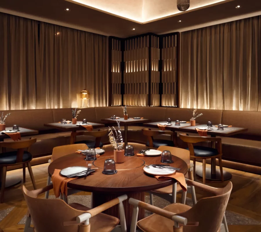
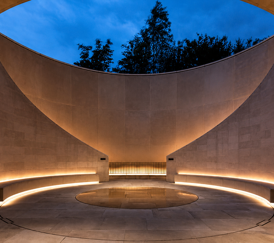
The warm white vs cool white question becomes critical in reception areas, hotel lobbies, restaurants, bars, boutique retail and collaborative workplace zones. For hospitality lighting design and residential environments, both frameworks point toward 2,700 to 3,000K.
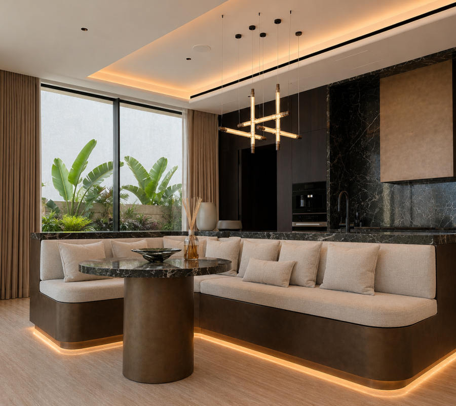
Most well-considered commercial schemes vary colour temperature by zone rather than applying one value throughout. A practical starting point: 4,000K for focused task areas; 3,000K for reception, collaboration zones and client-facing spaces; 2,700K for dining and lounge environments where atmosphere is the primary brief requirement.
What the Brief Rarely Addresses
Colour temperature does not work in isolation. Two things affect how it lands in a finished space that most briefs never discuss.
The first is light level. The same colour temperature reads differently depending on how much light is in the room. A warm 3,000K scheme at low light levels feels intimate and considered. The same 3,000K at very high light levels can feel flat. Colour temperature and brightness need to be decided together.
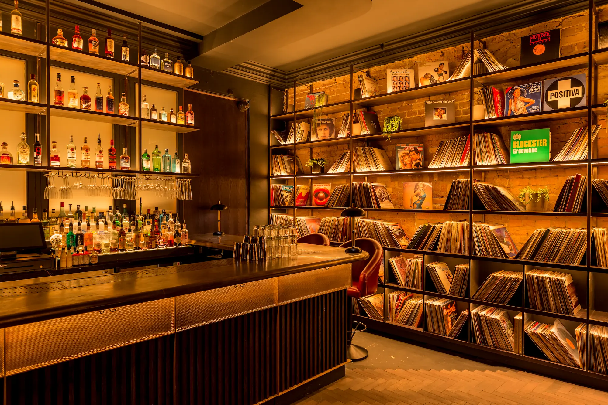
The second is surface interaction. Warm materials such as timber, brass and terracotta read richer under 3,000K. Under 4,000K they can appear flatter than intended. Paint colours are particularly sensitive: a white with warm undertones can look grey under 4,000K. A white with cool undertones can feel stark under 3,000K. These interactions become visible once the lights are switched on, not before.
For projects where supporting the natural rhythms of the people in a space is part of the brief, whether for WELL certification, workplace wellbeing or hospitality guest experience, colour temperature alone is only part of the answer. The quality and composition of the light matters too. Tunable white lighting systems that shift both colour temperature and light quality across the day are the more complete solution for human centric lighting and circadian lighting briefs.
For projects pursuing Estidama Pearl or Al Safat in the UAE, or BREEAM and WELL in the UK, these decisions carry wellbeing and sustainability implications that need to be resolved at the briefing stage.
Colour temperature is not a technical checkbox. It is one of the first decisions that shapes how a finished space is experienced, and the one most likely to go unexamined until something feels wrong.
At No Grey Area, we work with architects, interior designers and clients across commercial, hospitality and residential projects in the UAE and UK to make sure architectural lighting specification decisions including colour temperature are made at the right stage and for the right reasons. Get in touch with our team to discuss your next project.